Social media is becoming more accessible, and that is really great to see! So what can we do to go the extra mile? Well, that depends on what kind of content you create. But no matter what – we have some tips and tricks to show your audience that you care about their needs, and are willing to go the extra mile to include people from all walks of life.
Be Clear And Descriptive In Your Copy
Make good use of your copy. Make sure to mention all key text included in your content to avoid confusion and double down on your messaging. Try not to use too many hashtags in the middle of your copy, but rather leave them toward the end of the post. Also, if your hashtags include more than one word, capitalising the first letter of each word will make it easier to understand for screen readers. For example, #bigsale will be read as one word, while #BigSale will be read at two.
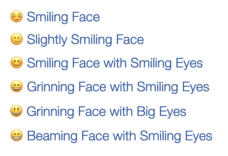
If you use emojis in your copy, take the time to consider what they are labelled as. Some emojis with a similar look have descriptions which may infer slightly different meanings.
Add Alt Text
Alt text describes your images for people with visual impairments, and a LOT of platforms have a way of inputting this – be it Twitter, Instagram, Giphy, and beyond.
Imagine that you’ve created an amazing image that will stop people in their tracks. It looks fantastic! However, without any alt text, users with visual impairments could miss it completely. This can be especially challenging on a site like Twitter with a restricted character limit for your copy.
Fortunately, setting up alt text is easy to do.
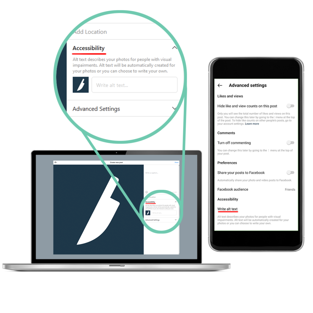
The option to input your alt text is located in various different locations, depending on the site you’re uploading it to. On Twitter, you’ll see an “edit” button in the bottom-right corner after uploading your image, whereas on Instagram it can be found under “Advanced Settings, Accessibility.”

Keep your descriptions clear and concise. For example, the image above could have the alt text, “A white knife logo on a blue background.” Make sure to format your alt text as if you were writing your post copy. Use full sentences, and try to capture not only what is in the image, but the tone in which it should be read. For instance, if your image is exciting, make your language reflect this!
Use A Palette That Is Colour-Blind Friendly
So alt text is a must of inclusivity, but what about designing for colour blindness? This can be tricky if you have a lot of red and green in your image, but there are all sorts of colour combinations to consider when making sure the details in your image are visible for people with this impairment.
Fortunately, there are some great online resources to test your images. This website for example applies filters to your images so you can get an idea of what someone with different degrees of colour blindness may see when looking at your post. If your image is clear and readable in all of these filters, then you’re good to go! If you find that you lose specific details, you should consider adding more contrast, or changing the colours completely.
Add Captions
But what if your post is a video? That’s where captions come in.
Captions are incredibly useful to add to your content. The obvious reason to add them is for the deaf/hard of hearing, or those with audio processing disorders to enjoy your content, which is reason enough itself. However, there are many other benefits, such as:
- Aiding those who struggle to understand thick accents/mumbled speech.
- Aiding those who are neurodivergent.
- Reaching viewers who have the sound off.
- Reaching viewers who speak a different language.
The best type of captions to add are “closed captions”. These are captions which aren’t rendered onto the video, but added with a separate captions file (usually .SRT). They can be turned on or off by the user, and customised to suit their specific needs. As of the time of writing, Youtube and Twitter both allow closed captions using .SRT files. Youtube allows for multiple languages to be uploaded as captions, making your video further accessible to people who may not speak the language used in your voiceover.
However you shouldn’t skip out on captions if the platform doesn’t allow them to be closed. “Open captions” are when the captions are burned into the video. They cannot be turned on or off by the user, and they cannot be customised. Instagram offers automatic captions on videos with a voiceover by using the captions sticker for stories or reels, and can be edited if any mistakes are made with the transcription. They are however, in our opinion, quite stylized, and not always fit for purpose.
If you find yourself adding open captions to your video, consider what they look like. Here are some tips to make clear, useful captions:
- Make sure they have a high contrast. Typically, captions should be white text on a black background, or white text with a black outline. If you want to add colour, make sure that the colours aren’t too similar, and avoid using bright neon colours as this can be painful to read.
- Make sure they are big enough. There is a temptation on social media to make captions small, but you must fight it! They should be big enough to read on a mobile device without straining. While it is a tool for broadcast, a good way to test your captions is to use the Clearcast supers test card.
- Use a clear, sans serif font when you’re able. This is because sans serif fonts typically have more shape to their characters, making them easier to recognize for all readers. We highly recommend the font “Atkinson Hyperlegible” for this purpose as it was designed with accessibility in mind, but other good options include Trebuchet, Veranda, and Arial. You should also consider using Open Dyslexic or Comic Sans, as these fonts are easier to process for Neurodivergent people. Avoid all caps to increase readability.
- Use speaker recognition if you have more than one person speaking. This could be something as simple as adding the speaker’s name to the beginning of their captions. However another way to do this is to colour code your captions per speaker, meaning less text to read (just make sure that the colours are colour blind friendly).
- Do not cover faces with captions, as this will hinder people’s abilities to lip read.
- Include audio descriptions when appropriate. If the music or sound effects of your content are helping to set a particular mood, then they should be included so the viewer can still appreciate the tone that is intended (for instance, an emotive ad campaign).
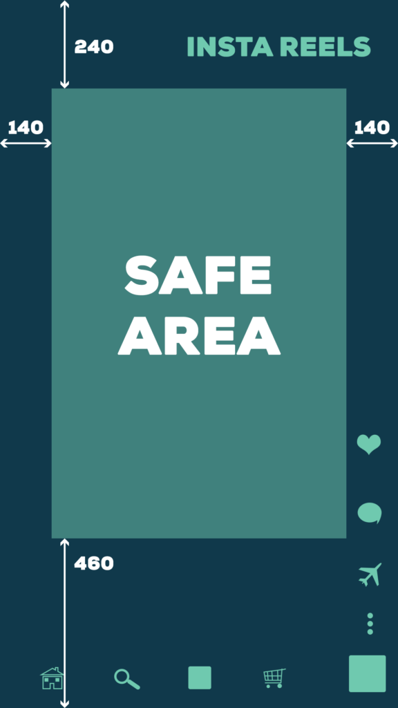
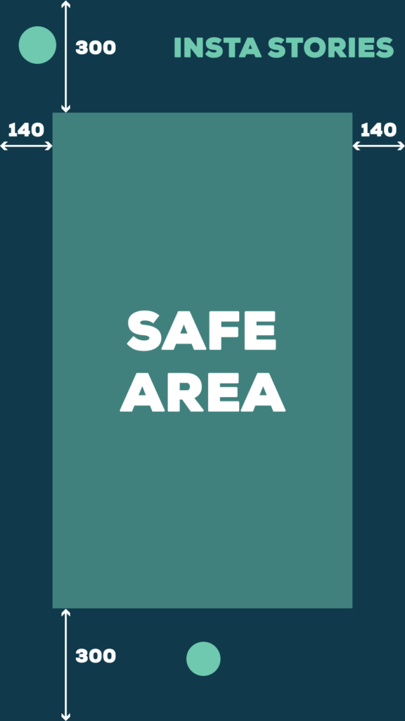
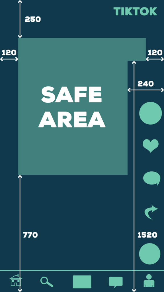
- Make sure your captions are placed within the safe area of your video (preferably close to the bottom), and not covered by any buttons. This will vary from platform to platform, so make sure you do your research.
Having captions for your video will also help with our next point…
Match Your Visuals With Audio
Having your visuals and audio working in sync is a great way to make sure your message is being delivered as clearly as possible. This is great for general viewers, as they are being assured both visually and audibly of your messaging, and also allows those who rely solely on visuals or audio to still be included.
Try not to have information presented only one way. If text on screen is presenting details of an offer, accompany it with a voiceover. If a narrator reads out your web address, include it written on screen too.
Consider using a voiceover for your content regularly for this very reason. Videos do not have alt text, just captions, so are not accessible to those with auditory impairments without it.
All in all, you should think about the accessibility of your content at the start of the creative process, to maximise its effectiveness. This is something we strive for here at Stoke + Dagger, and believe that it leads to better, more inclusive, social media campaigns.